In the past year or so, it feels like the wedding scene has been bombarded by blush. Pastel pinks, peaches, mints, and pale yellows have been all the rage for our past weddings. Like we’ve said before, we still cannot get enough of this color palette, but we must admit, we’re pretty darn excited when a bride lets us take her design in a bold new direction. Bringing brights into a color palette is so much fun and can really showcase a bride and groom’s sassy personalities. We love the idea of hot pinks, bright oranges, yummy yellows, pungent purples, and gorgeous greens (and awesome alliteration).
While we don’t want to reveal all of the beauty we have in store for this weekend’s colorful wedding just yet, we can’t help but share a few sneak peaks of the floral and show you what inspired us (besides the bride and her mom’s amazing energy, of course!).
When this bride and her mom first came to us, they insisted on hot pink. The bride’s favorite color, this bright hue needed to make an appearance at the wedding. With this in mind, we dove into creating her inspiration board. We knew we had to bring in brights, but we wanted to keep it classy and less “child’s fifth birthday party”. In order to do this, we found inspiration from the bride’s favorite designer, Lilly Pulitzer. Check out the work that influenced this couple’s invitations.
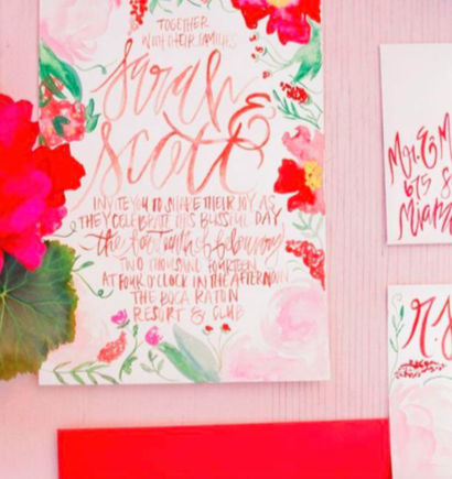
When we saw these, we were totally swooning over the watercolor and garden-inspired design and just had to have these incorporated into this wedding!
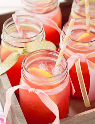
Such an important piece of designing is keeping the look consistent, in some shape or form, throughout the entire wedding. It doesn’t have to be blatant, but there needs to be a way to tie everything together, from the first piece of stationary to the favors at the end of the night. One way we love doing this is incorporating color into the signature cocktail. Inspired by these beauties below and mom’s master mixing skills, we came up with a pink drink that is sure to keep the guests coming back for more!
With just a day to the wedding, we knew the florals would be coming together nicely. When we heard Blush Floral Design (our in-house florist) had the florals for this weekend in their space, we couldn’t wait to rush downstairs and take a look. Now, we know they do amazing work, but we were blown away when we saw this beauty!
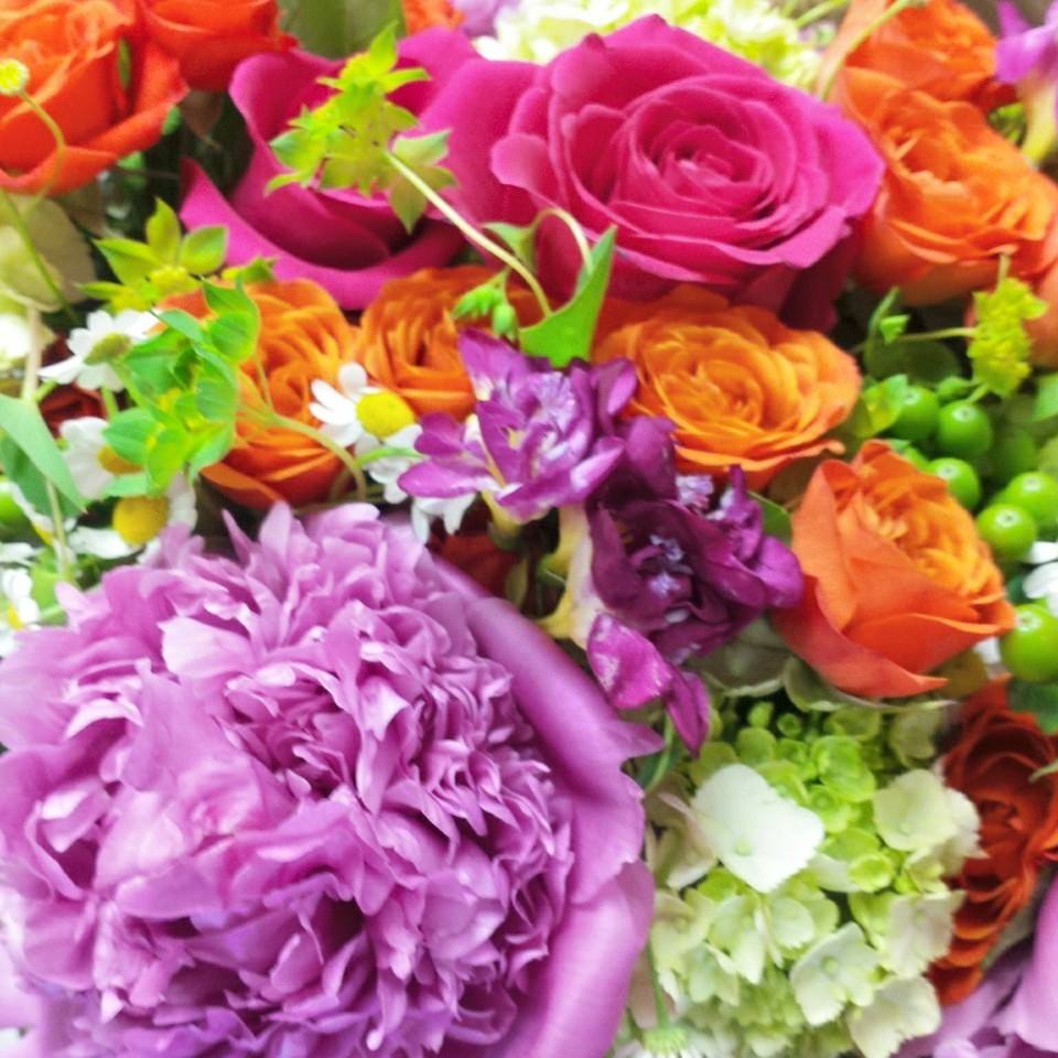
We are simply gushing over the pairings of colors and flower types. The variety makes for such a fun design and the bold colors look good enough to eat! We cannot wait to see how these pop against the white backdrop of the tent this weekend.
Our piece of advice to couples is this: don’t be afraid to be bold! While blushes and soft pastels are absolutely breathtaking, there is something to be said for bright pops of color that really bring the design to life. So go after that bright blue, that punch of pink, or that bright yellow that is sure to wow your guests!